Appearance
Match the chat widget to your brand — themes, colors, messages, and behavior.
Settings → Appearance controls how your agent's chat looks and feels. A live preview on the left updates as you change settings on the right. Three sub-tabs cover the three widget styles: Lightbox, Bubble, and Content.
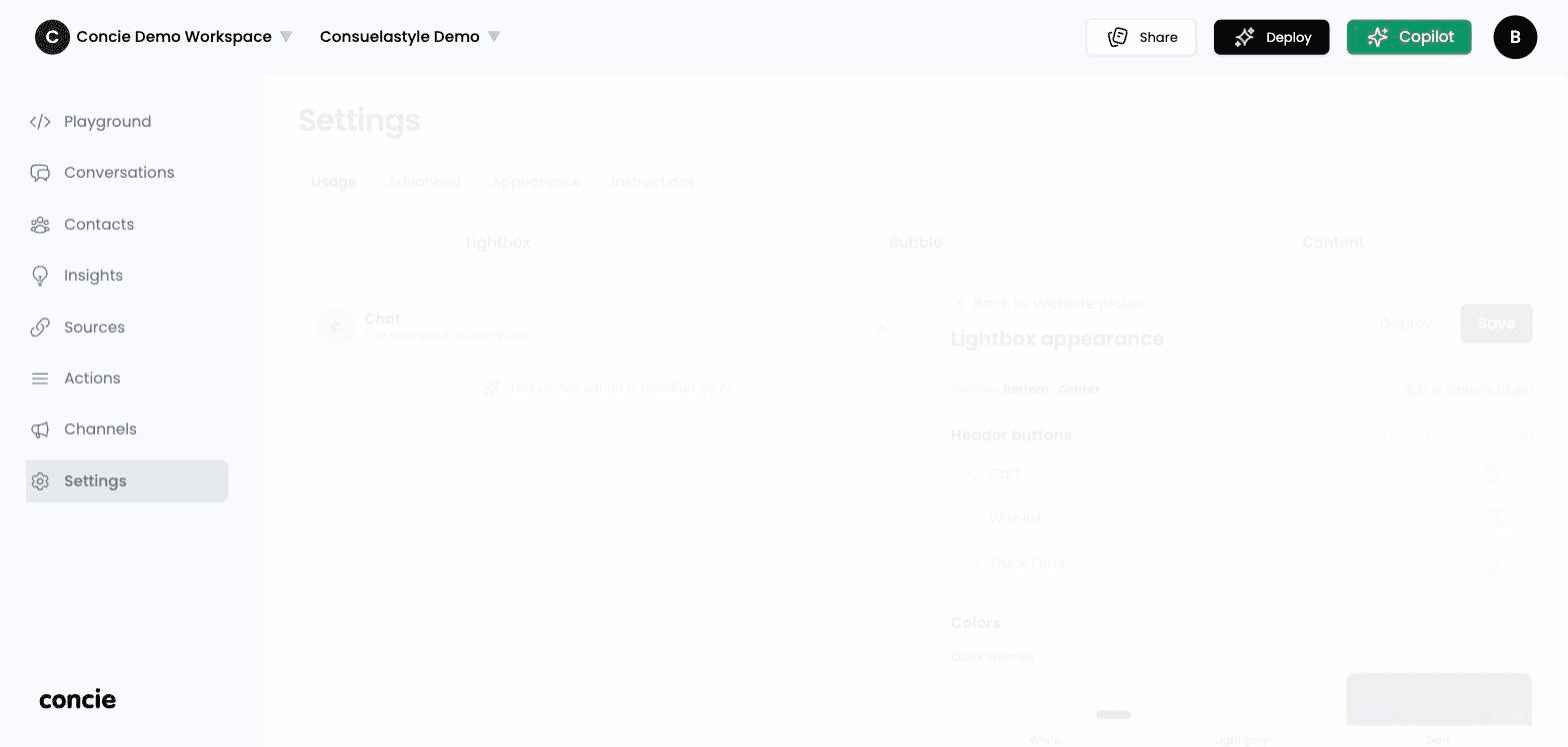
Quick themes & colors
- Quick themes — start from White, Light grey, or Dark.
- Colors — fine-tune the agent message background, the customer message background, the chat background, and the primary/button color.
Header buttons
Toggle the buttons shown in the widget header — Cart, Wishlist, and Track Order. (These appear only when a store is connected.)
Messages
- Welcome message — the greeting shown when the chat opens.
- Placeholder text — the hint inside the input box.
- Widget info message — an optional note in the widget.
Features
A set of toggles for the chat experience, including customer feedback (thumbs up/down), emojis, auto-complete suggestions, message timestamps, full-screen mode, and read-aloud (text-to-speech) with a voice picker.
Layout & sizing
Set the widget position, the closed-pill alignment, and sizes (width, expanded height, input-bar height, edge spacing).
Click Save, then Deploy to push your changes live.
Related
- Deploy — where the styled widget runs